


Simplification is not reduction. Or at least, it shouldn’t be.
Interface simplification is often approached as an exercise in removal: fewer elements, fewer options, less noise. This works in early-stage products, but in complex systems it often introduces side effects: loss of context, less informed decision-making, and increased reliance on user memory.
This pattern—common in redesigns—typically stems from three recurring dynamics: over-pruning (removing more than the system can support), decisions driven by visual rather than functional criteria, and simplification applied at the interface level without addressing the underlying product structure.
What simplifying actually means in complex digital products
Reducing cognitive load vs. reducing capability
Simplification means reducing the effort required to understand and operate a system—not necessarily reducing what the system enables users to do. In complex products, removing options rarely eliminates complexity; it tends to displace it onto the user, who is left with less information to make decisions.
The distinction is subtle but critical: an interface can present fewer elements while demanding greater cognitive effort.
The role of mental models in simplification
An interface feels simple when its structure aligns with users’ mental models of the domain.
When this alignment exists, even complex systems are perceived as manageable. When it breaks—through arbitrary grouping, unclear categorisation, or unexpected structural changes—the interface loses predictability. Users are forced not only to interact, but to continuously reinterpret the system.
Perceived vs. inherent complexity
Effective simplification does not eliminate inherent complexity; it redistributes it more effectively.
This requires deciding which aspects of complexity:
- should remain visible,
- which can be deferred,
- and which can be abstracted without reducing capability.
Hiding is not simplifying. In many cases, it merely postpones the problem.
4 ways simplification degrades the experience
1. Removal of critical signals for decision-making
Eliminating comparisons, states, or temporal references may result in a cleaner interface, but reduces its informational value. Users shift from interpreting to inferring, increasing the likelihood of errors.
2. Overly abstract or generic interfaces
Heavy reliance on iconography or generic patterns is often framed as simplification. However, without sufficient contextualisation, these elements introduce ambiguity. Visual clarity increases, but operational clarity decreases.
3. Loss of affordances and feedback
Reducing elements can remove cues that signal interactivity or system response. Without these, the interface is no longer self-explanatory and requires explicit learning.
4. Common cases: dashboards, B2B tools, and expert workflows
This issue becomes especially visible in dashboards. In many redesigns, simplification translates into hiding filters, reducing visible metrics, or removing labels.
💡 In the following example, the difference is not in the amount of information, but in how it is structured and presented:

The initial version may reduce visible elements but introduce ambiguity: hidden controls, less explicit navigation, and limited context for interpretation.
The revised version does not remove capability, but reorganises information: maintaining key metrics, adding interpretive context, and making decisions accessible without increasing cognitive load.
The difference is not in the amount of information, but in how it is structured and presented.
Principles for simplifying without losing capability
Progressive disclosure (beyond “hide by default”)
Progressive disclosure is not about hiding content, but about sequencing it appropriately. Information should surface when needed, without forcing active search.
⚠️ When misapplied, it creates layers of hidden complexity that make navigation harder.
Information hierarchy based on frequency and criticality
Effective simplification does not mean uniformly reducing elements, but prioritizing them according to use and impact. Not all information carries the same weight, nor do all actions require the same visibility.
A useful criterion is to cross frequency of use with task criticality to determine what should remain visible, what can be deferred, and what can be removed.
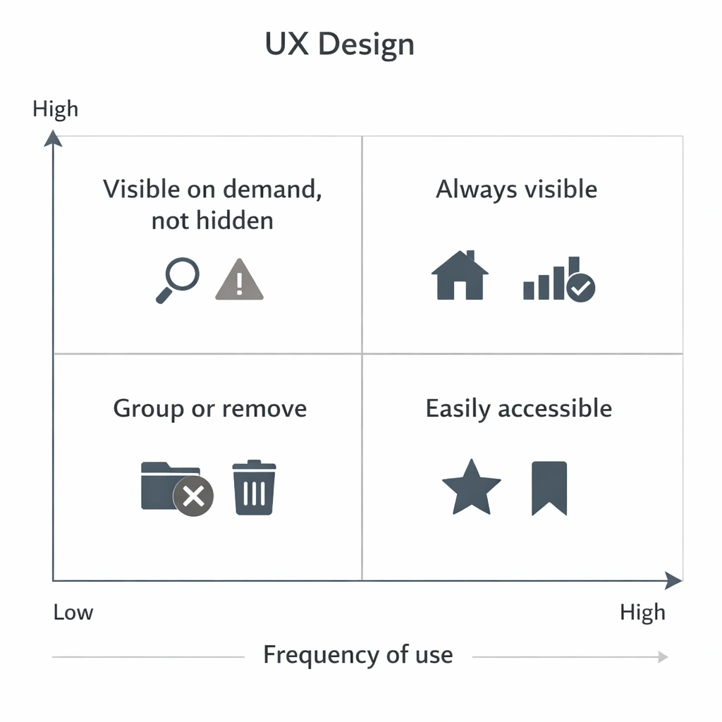
This type of framework avoids arbitrary decisions and helps align design, business, and real usage.
In practice, it introduces a clear logic: always keep critical and frequent elements visible, make secondary ones accessible, and avoid hiding elements that, although infrequent, have high impact when they occur.
Designing for different levels of expertise
An interface that only supports novice users is not simpler—it is constrained.
In complex products, simplification must support progressive learning without penalising expert efficiency. Not all complexity should be removed; it should be made accessible at the right moment.
Functional redundancy vs. unnecessary duplication
Eliminating redundancy is not always beneficial. In many cases, repeating information reduces navigation effort and memory load.
The key is distinguishing between functional redundancy (which supports usability) and unnecessary duplication (which introduces noise).
Design strategies in mature teams
Evidence-based simplification (research + usage data)
Simplification driven by intuition tends to prioritise what is visible. Evidence-based approaches identify what actually adds value in real usage.
This includes analysing behavioural data and understanding why certain elements—though infrequent—are critical in specific contexts.
Flow deconstruction: what to remove, regroup, or make explicit
Simplifying without reviewing end-to-end flows often introduces inconsistencies. Deconstructing flows helps identify redundant steps, unnecessary decisions, and missing information.
The outcome is not just a cleaner interface, but a more coherent system.
Microcopy as a mechanism for cognitive compression
Language directly impacts perceived complexity. Precise labels reduce ambiguity, minimise exploration, and accelerate decision-making.
Microcopy is not a detail, but a structural tool for simplification.
Design systems as a tool for coherence, not restriction
Design systems reduce variability, but they do not replace design judgement.
Used uncritically, they can lead to homogeneous solutions that are poorly adapted to context. Their value lies in enabling consistency while supporting complexity.
How to validate that simplification does not degrade the experience
Metrics beyond time-on-task (error rate, reversibility, confidence)
Reduced task time is not sufficient. It is critical to assess error rates, ease of recovery, and user confidence.
An interface may appear more efficient while producing more fragile decisions.
Testing with expert vs. generalist users
Generalist users tend to favour guided, simplified interfaces. Expert users prioritise speed, control, and information density.
Evaluating both profiles helps identify imbalances.
Longitudinal evaluation: impact on learning and efficiency
Some simplifications perform well initially but degrade long-term efficiency. Evaluation should consider how interaction evolves over time.
Experience is not defined by first use, but by sustained use.
Qualitative signals: invisible friction and workarounds
When users create external artefacts—notes, shortcuts, parallel processes—they are compensating for design shortcomings. These signals may not appear in metrics, but they reveal unresolved complexity.
Conclusion
Simplifying is not about removing elements, but about reorganising cognitive effort.
A cleaner interface may appear better, but if it reduces users’ ability to understand, decide, or act, the experience degrades. In complex products, the goal is not to minimise the interface, but to make it more intelligible.
Reducing elements is relatively straightforward. Designing systems that preserve capability while reducing friction is where UX maturity is demonstrated.