

Dark Mode has evolved from a mere visual preference into a key tool for accessibility, well-being, and digital efficiency.
But did you know that poor Dark Mode design can harm your users’ experience—and even impact business goals?
In this article, we explore why Dark Mode matters more than it seems, what common mistakes many brands make when implementing it, the role of artificial intelligence in its evolution, and how to design it effectively from an accessibility standpoint.
A standard born as an exception
Although today we find it in virtually all operating systems, Dark Mode is not a recent invention. It emerged as a technical necessity in early monitors, when displaying white text on a black background was more energy-efficient. Starting in the 1990s, with the rise of graphical interfaces and the metaphor of printed paper, white became the norm.
But the context has changed. The diversity of devices, visual fatigue from prolonged screen use, and growing demand for accessibility have brought Dark Mode back to the forefront. Apple and Google made it official in 2019, and since then its presence has grown into a standard.
Today, more than 80% of Android users use it regularly.
However, this mass adoption has come with misconceptions and implementation mistakes.
When using Dark Mode is a good idea
Dark Mode can improve visual comfort and energy savings. But it’s not universal. Its effectiveness depends on the usage context, the type of task, the physical environment, and the user’s visual conditions.
It works particularly well in:
- imly lit or nighttime environments
- short tasks or quick lookups
- OLED screens, where it reduces energy consumption
- users with photophobia, migraines, or light sensitivity
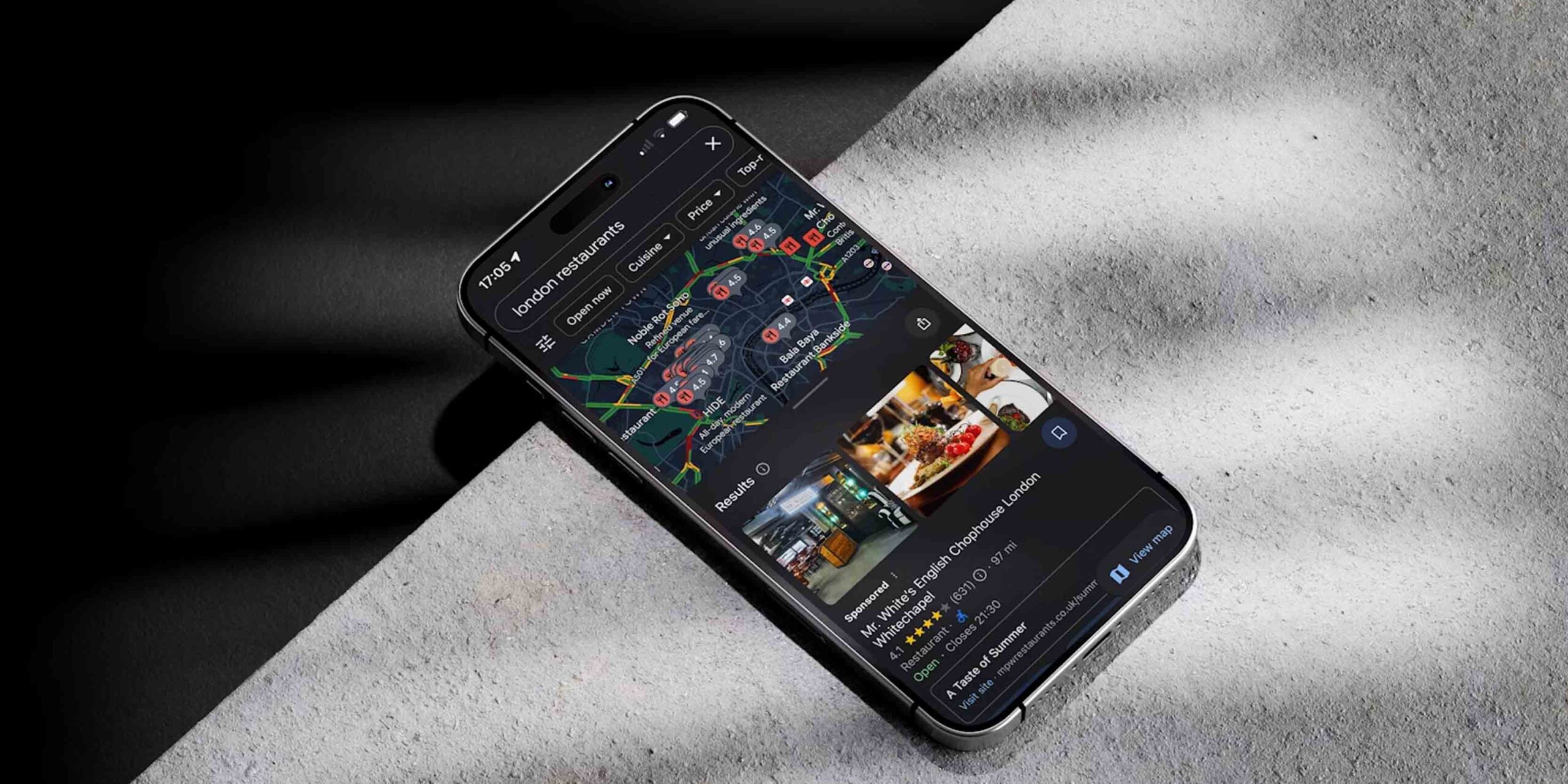
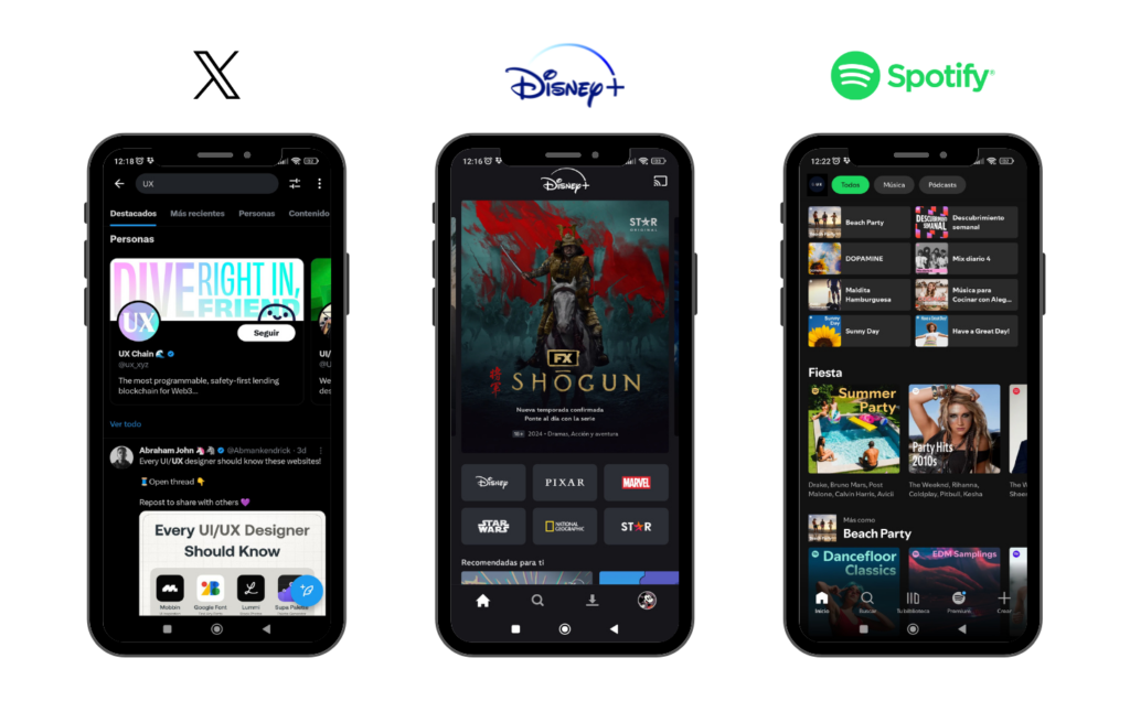
- interfaces with predominantly visual content (video, photography, design)
But it can hinder the experience when:
- tasks involve intensive reading or data analysis
- the environment has a lot of ambient light (open offices, outdoors)
- users have astigmatism or dyslexia
- the design requires high visual precision and clear hierarchy
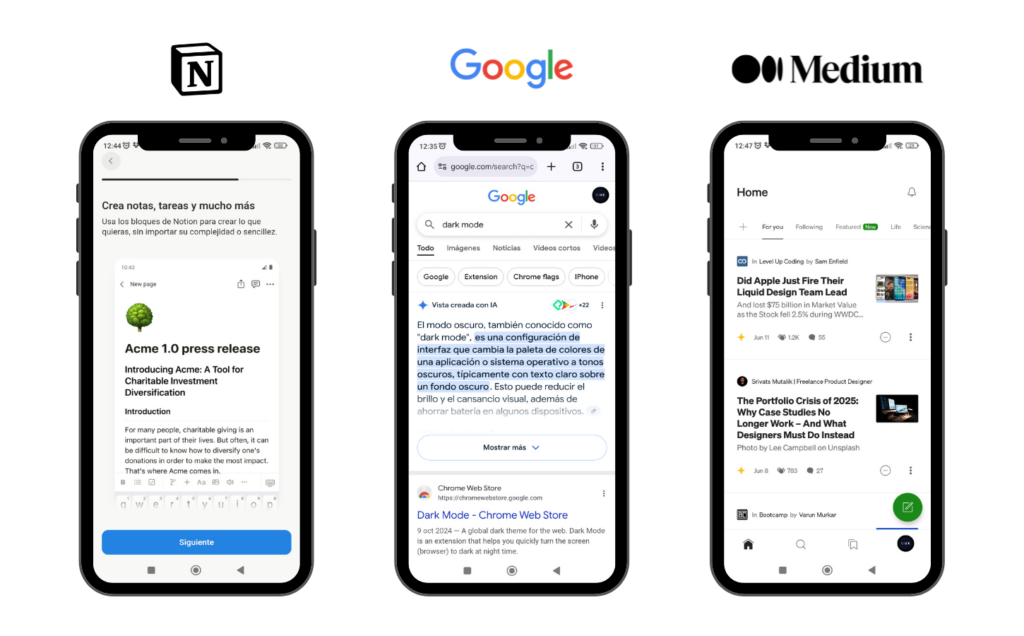
A 2021 study from the University of Tübingen showed that reading speed drops by 20% to 26% in dark interfaces, especially for long texts.
Effective design must observe, interpret, and adapt to users.
What to consider before applying Dark Mode: accessibility
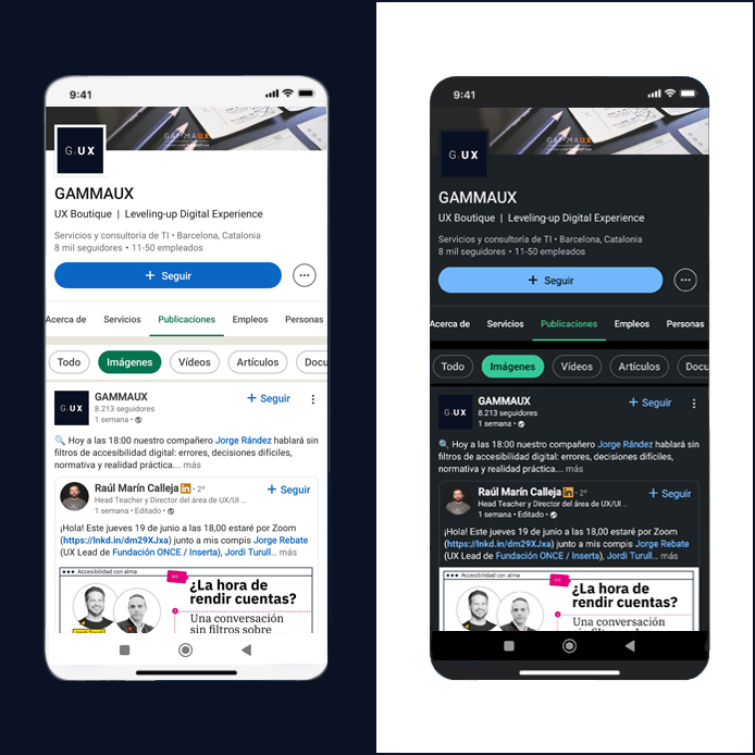
One of the most common mistakes when implementing Dark Mode is assuming it’s enough to simply invert the colors. It’s not. Pure black backgrounds with pure white text generate excessive contrast, which can be more aggressive than legible.
Designing a truly accessible Dark Mode requires nuanced decisions: using dark grays for the background, slightly desaturated whites for the text, and brand colors adapted to a tonal scale that preserves contrast without being jarring.
Moreover, it’s not just about color. Many digital products fail to properly adapt their components to Dark Mode, causing buttons, forms, alerts, or floating elements to lose visibility or create confusion.
Over 2.2 billion people worldwide live with some form of visual impairment (WHO, 2023)
The visual design of an interface is not just an aesthetic issue. It is a central part of the experience—and it holds the power to include or exclude, to ease or hinder, to support or confuse.
The future of Dark Mode: Artificial intelligence and adaptive design
One of the most promising fields in digital product design is the application of artificial intelligence to interface personalization. And Dark Mode can especially benefit from this evolution.
It is already possible to imagine—and in some cases implement—systems that:
- detect ambient light levels and automatically adjust the display mode
- identify visual fatigue patterns and adjust contrast or font size
- learn from each user’s habits to offer more comfortable and sustainable experiences
Thanks to AI, design is no longer static. It becomes a system that observes, interprets, and improves in real time the relationship between the product and the person using it.
Rethinking your product’s visual experience?
If you’re considering adding or redesigning your product’s Dark Mode, we can help you make an informed decision tailored to your goals and your users’ real needs.
At GammaUX, we design with people in mind—not with trends.