

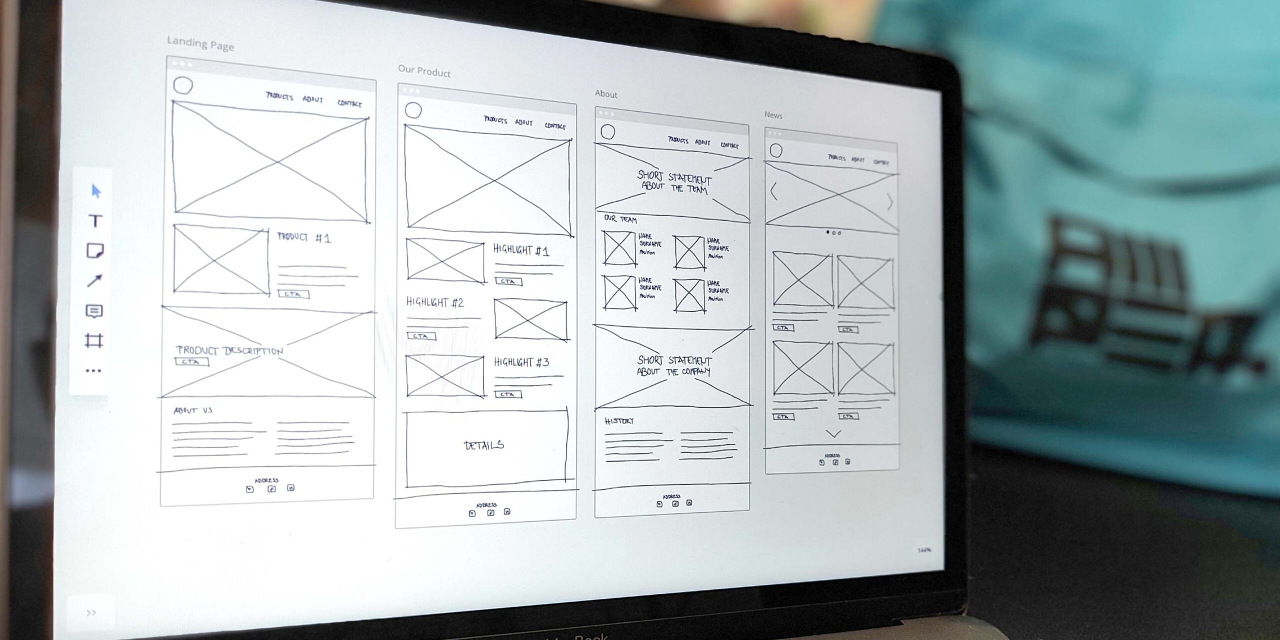
The grid used during the development of responsive interfaces is key to establishing visual coherence and delivering a good user experience. In this way, UI design uses spacing as a tool to organize system components attractively and functionally.
When a design is unclear, it is often due to the use of irregular spaces or poorly aligned elements that appear to float or be disconnected. The origin of such inconsistencies usually lies in a poorly applied grid, which makes it difficult to scale the system and generates friction for the user.
Although every system is unique and it is important to establish a grid that responds to its specific needs, some standards, such as the 8-Point Grid System, are very common in the digital environment. In this article, we analyze the types of grids that exist and how to make the most of each, finally focusing on the two most used.
What is a grid?
The grid is the method that organizes the visual components of an interface, establishing relationships and hierarchies between them. Using a network that combines vertical and horizontal lines brings coherence to the design and allows the development of an orderly and smooth user experience. It guides the user’s gaze, defines reading patterns, and ensures consistency across different devices.
It has a strong influence on the system’s readability, which it regulates through decisions about spacing, line height, text block size, or the arrangement of different sections, among other aspects. In this way, its implementation facilitates the balance between content areas and empty space, establishing a certain visual rhythm and influencing the user’s perception.
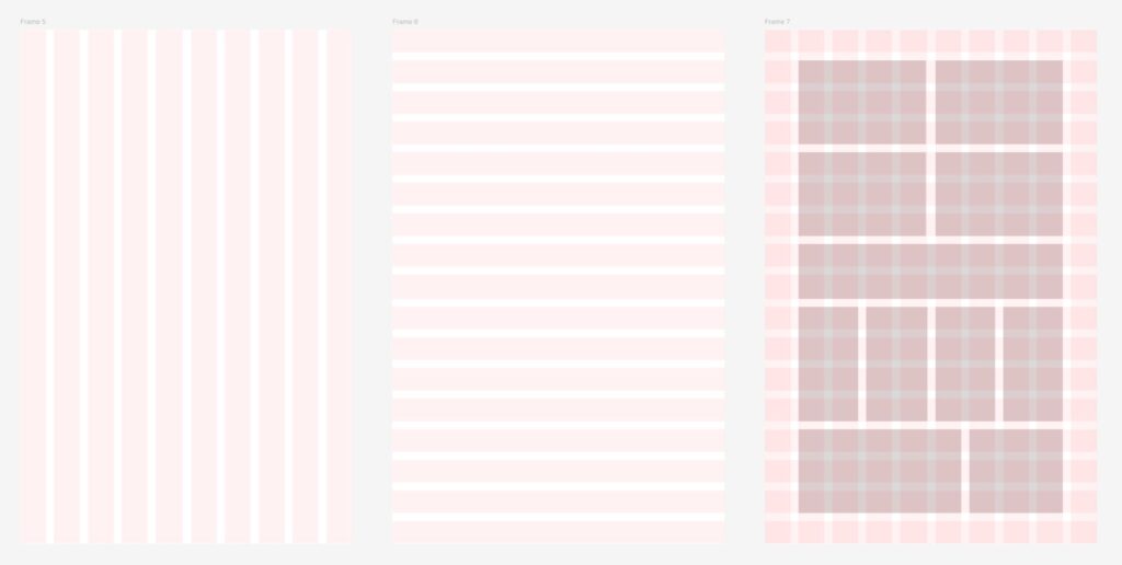
Types of grids and when to use them
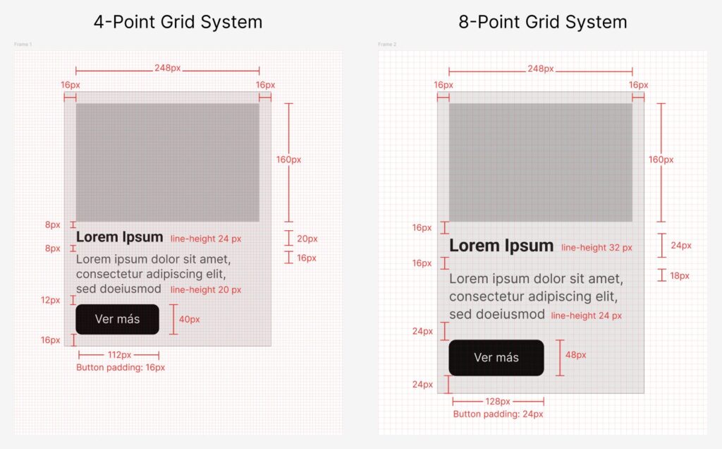
There are several types of grids that adapt to different design needs and usage contexts. The most widespread in the digital environment is the 8-Point Grid System: a choice focused on using multiples of 8 px, offering simplicity and good scalability.
Other formats use grids based on multiples of 4, 2, or 10 px, or are organized around line height. They are as follows:
| Type of grid | Spacing | Performs well in: |
| 8-Point Grid System | Multiples of 8 px | Large-scale design systems and cross-platform products. Favors consistency, faster implementation, and responsive adaptation. |
| 4-Point Grid System | Multiples of 4 px | Environments that require a good balance between detail and scalability. Offers greater typographic control and micro-spacing without losing overall consistency. |
| 2-Point Grid System | Multiples of 2 px | Precise micro-adjustments in icons, typographic details, and very small elements where minimal misalignment can break visual harmony. |
| 10-Point Grid System | Multiples of 10 px | Modular interfaces with wide or industrial structures, and projects that prioritize large, clear divisions. |
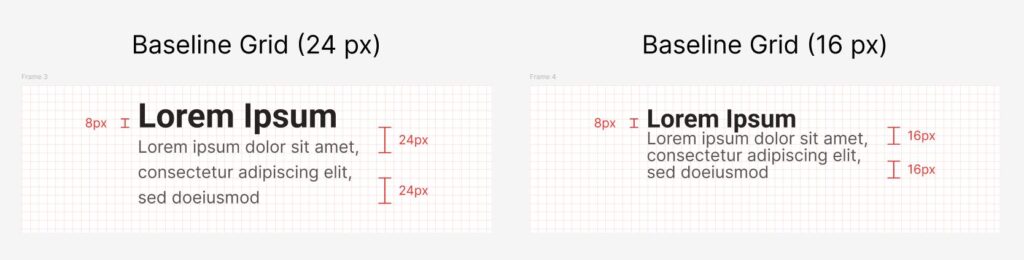
| Baseline Grid | Line height of 4 px, 6 px, or 8 px | Long reading experiences. Provides a constant visual rhythm in text-heavy environments, improving comprehension and reducing visual fatigue. |
The 8-Point Grid System and the origin of grids
The 8-Point Grid System became a standard between 2017 and 2018, thanks to the work of designers like Elliot Dahl and the influence of major companies such as Google and IBM.
Its widespread adoption sped up product development and allowed the creation of more organized interfaces. It facilitated the adoption of responsive design and the generation of reusable components, creating a common language for teams and laying the foundations of modular design.
However, over time, the 8-Point Grid System proved too rigid for some situations. This is especially evident during the development of small elements, icons, animations, and text-heavy environments, where font sizes do not always fit into a structure of 8 px multiples.
The 4-Point Grid System: precision and flexibility
Unlike the grid based on multiples of 8 px, the 4-Point Grid System offers a perfect balance between control and adaptability. Using multiples of 4 px allows for more precise spacing for small components, as well as better alignment between different components.
It provides an advantage regarding line height and vertical margins, whose adjustments often create jumps and visual inconsistencies. This system better adapts to the x-height and the optical grid of the font, so it is recommended in editorial environments and interfaces with a lot of text.
It also promotes consistency in layouts that combine text, icons, buttons, and interactive elements. All of this provides unique flexibility in the development of systems adapted to multiple current platforms, including websites as well as iOS, Android, and wearable device environments.
The 4-Point Grid System: tips and best practices
When implementing the 4-Point Grid System, a good practice is to use low multiples (between 4 px and 16 px) for component padding and typographic adjustments, reserving higher multiples (24 px to 64 px) for margins between sections and layouts. It is important to keep in mind that font size will not always be a multiple of 4, but line-height should be, to maintain vertical design consistency.
Defining a spacing token system (for example, spacing-1 = 4 px, spacing-2 = 8 px, spacing-3 = 12 px, etc.) helps design and development teams understand the logic followed by the interface grid. This prior planning avoids arbitrary decisions, facilitates system scalability, and speeds up iterative and handoff processes.
Set a 4 px base grid when designing in platforms like Figma or Sketch and use it as a reference framework for 90% of design decisions. Including 10% of conscious and justified exceptions helps break potential rigidity while adding naturalness, differentiation, and authenticity to the product or service.
Want to improve your design structure?
We know that the grid is not just an aesthetic issue. It is an essential and strategic decision that impacts design efficiency, development speed, and the quality of the final product.
If you want to work with UI design talent, at GammaUX we have specialists in interface development. Write to us at support@gammaux.com without commitment, and we will analyze how to turn your system into a competitive advantage. Shall we talk?