Study case
For this second part of “Combining purposive sampling and k-means algorithm for qualitative research sampling”, we will commence with a hypothetical and generalizable case study, with the intention of facilitating the extrapolation of the presented guide to other specific instances. Let us consider we face the challenge of initiating qualitative research on the usage habits and usability pain points of an e-commerce platform. To be more precise, this research would entail conducting in-depth interviews and usability tests involving diverse user profiles who actively engage with our e-commerce. Given the prevalence of constrained timelines and limited resources in research endeavors, sample selection presents a crucial challenge. Specifically, the determination of both the number and characteristics of the users to be interviewed results is highly determinant. The recruitment phase can significantly impact the outcomes of our qualitative research and all the decisions derived from that. The procedure for that challenge consists of running the k-means algorithm to analyze our target populational and, then, applying researcher expertise to decide who should be interviewed to achieve theoretical saturation.
The sine qua non prerequisite for the application of the k-means algorithm and, consequently, to successfully proceed with the stratified purposive sampling guide lies in the acquisition of pertinent and quality data, particularly, continuous numerical variables. It is not necessary an exhaustive dataset including the entirety of our target population. Rather, a statistically representative sample shall suffice. In any case, normally, it is not an easy exercise to get a quality and reliable dataset, it requires mixing primary and secondary data sources and, then, data cleaning. In this sense, we will operate under the assumption that our e-commerce database consists of a modest sample size of 200 users and encompasses solely four variables:
- Gender as the only categorical variable.
- Age.
- Annual income in $.
- Customer Engagement Score (CES), which is a metric that assesses the level of customer engagement based on both the time users spend in the app and their expenditure.
The distribution of gender in our dataset is 56% female and 44% male. Below, the distribution of the three numerical continuous variables, which will be the ones processed by k-means, are shown through histograms.
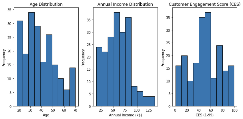
- For the age variable, the minimum value is 18, the maximum 70, the mean is 38.9 and the standard deviation is 13.9. This standard deviation value indicates that there is a moderate amount of variability in the ages. Nevertheless, as we can see in the histogram, the distribution is right-skewed.
- Regarding the Annual Income distribution, the minimum and maximum respectively are $15k and $175k, the mean is $60.6k and the standard deviation is $26.2k. Again, the distribution is right-skewed, with a small representation above $90k.
- Finally, the CES variable. In this hypothetical scenario, a CES score of 1 would indicate very minimal engagement from users in terms of both expenditure and time spent in the app and a CES score of 99 would indicate extremely high engagement from users, both in terms of expenditure and time spent in the app. We observe that the mean for this variable is 50.2 and the standard deviation is 25.8, being closer to a normal distribution than Age and Annual Income.
In the forthcoming section, we will showcase the Python code utilized for implementing the k-means algorithm in our case study. Besides, we will employ a widely recognized validation technique to determine the optimal value of K, that is to say, the final number of clusters: the elbow curve (Tomar, 2022).
Applying the k-means algorithm
In this section, I will be showing and describing the lines of code that will allow us to implement the k-means algorithm in our dataset. First of all, we need to import the required libraries with their respective abbreviations:
- Pandas
- Matplotlib.pyplot
- Scikit-learn.
Regarding matplotlib library, we take the subpackage mpl_toolkits.mplot3d to import the module Axes3D, which provides tools for creating 3D plots and visualizations. From sckit-learn, we will import the KMeans algorithm.

The next step is to use the pandas function to read the CSV file that contains our dataset. We will name the dataset df, as an abbreviature of DataFrame. In the context of the pandas library in Python, a DataFrame is a two-dimensional labeled data structure. Each column in a DataFrame represents a variable or a feature, while each row represents an observation or an entry. Once the DataFrame is loaded, we keep all the 200 entries but we select only the columns that contain numerical continuous variables, which the k-means algorithm will use to cluster the users. Considering gender is a categorical variable, we temporarily discard it from our analysis.

Following, we proceed to plot the elbow curve, which will help us detect the optimal number of clusters into which our cases will be split. The code begins by initializing an empty list called SSE, which stands for Sum of Squared Errors. This metric quantifies the overall within-cluster variance, measuring how close the data points are to their assigned cluster centers using Euclidean distance. Lower SSE values indicate better clustering. Next, a loop is executed to iterate through different cluster numbers, ranging from 1 to 9. For each cluster value, a new instance of the k-means algorithm is created using the KMeans function. The ‘n_clusters’ parameter is set to the current cluster number, and the ‘init’ parameter is set to ‘k-means++’, which improves the initialization of cluster centroids. The k-means algorithm is then fitted to the input data represented by the ‘df’ variable, which contains the user’s dataset.
The algorithm iteratively assigns data points to clusters and adjusts the cluster centroids to minimize the within-cluster variance. The inertia, which is the sum of squared distances between each data point and its nearest centroid, is computed using the ‘kmeans.inertia_’ attribute. This value is then appended to the SSE list, capturing the clustering quality for the current number of clusters.

After the loop completes, the SSE values are organized into a Pandas DataFrame called ‘frame’, where each row corresponds to a specific cluster number and its corresponding SSE value. This DataFrame is then used to visualize the relationship between the number of clusters and the inertia.

Using the Matplotlib library, a plot is generated with the x-axis representing the number of clusters and the y-axis representing the inertia. The resulting line graph is known as an elbow curve, and it helps determine the optimal number of clusters for the given dataset. The elbow curve usually exhibits a decreasing trend as the number of clusters increases, but at a certain point, the rate of decrease becomes less significant, creating a bend or “elbow” in the curve. This bend represents a trade-off between capturing more detailed patterns by increasing the number of clusters and maintaining simplicity by keeping the number of clusters low.
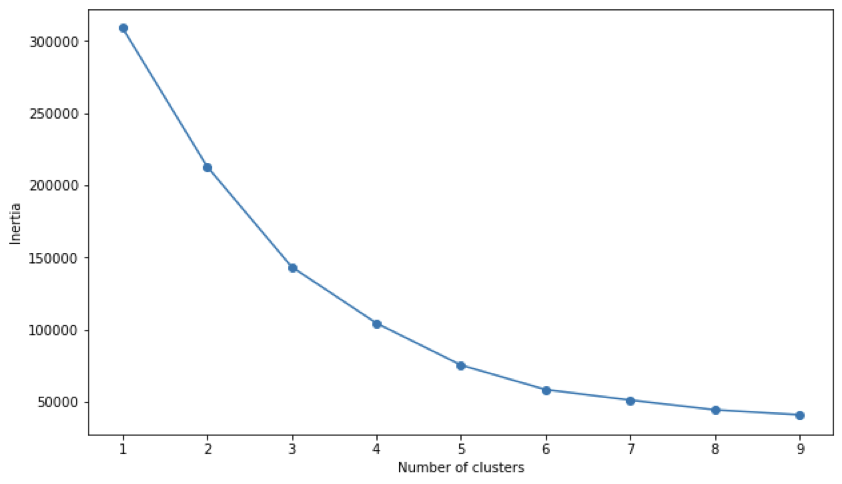
The elbow curve may not always exhibit a clear and distinct “elbow” point where the inertia drastically changes. In our specific case, a soft elbow appears at the value of 5 for clusters. This implies that increasing the number of clusters beyond 5 might lead to diminishing improvements in clustering quality. While a pronounced elbow point often signifies an optimal number of clusters, the absence of a clear elbow suggests that determining the ideal cluster count may require context expertise and business intelligence.
Finally, we configure the k-means algorithm by setting the parameter ‘n_clusters’ to 5. Next, we apply the algorithm to the data in ‘df’. The fit_predict() method fits the KMeans model to the data, assigning each data point in df to one of the clusters. The cluster assignments for each data point are stored in the y_predicted variable. In the last step, we add a new column called ‘Cluster’ to the DataFrame df and assign the values of y_predicted to this column. Each value represents the cluster assignment for the corresponding data point in df.

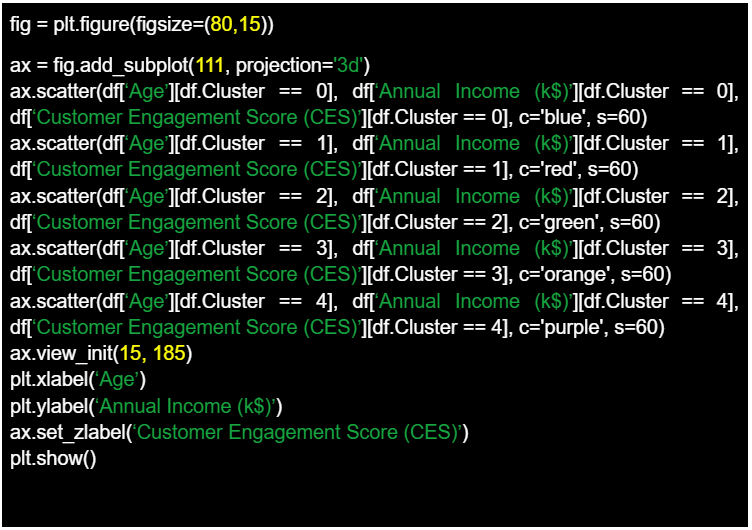
Using again the Matplotlib library, we reach the final of our exercise by generating a 3D scatter plot to visualize the results of a clustering analysis. The code then proceeds to plot data points in the 3D space. Each scatter plot command represents a different cluster, where data points belonging to a specific cluster are selected using conditional indexing. The data points are plotted based on their “Age,” “Annual Income (k$),” and “Customer Engagement Score (CES)” attributes from the DataFrame df. Each cluster is assigned a different color. The view_init() function is used to set the viewing angle of the 3D plot, specifying an elevation angle of 15 and an azimuth angle of 185. Axis labels are set for the x-axis (Age), y-axis (Annual Income (k$)), and z-axis (Customer Engagement Score (CES)).
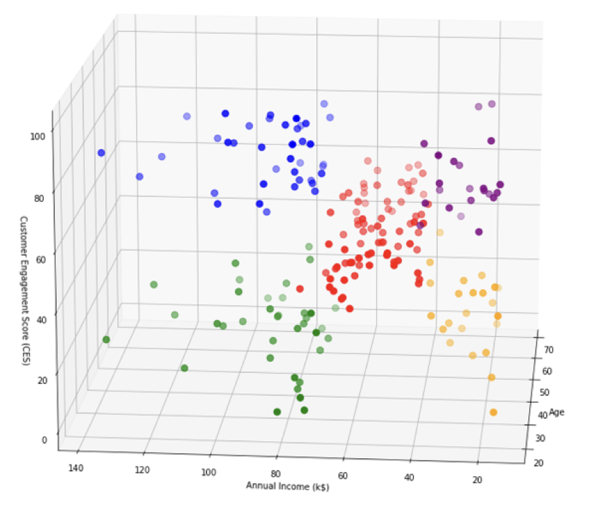
Overall, the final result is a 3D scatter plot to visually represent clusters based on the age, annual Income (k$), and customer Engagement Score (CES) attributes, facilitating the analysis and interpretation. We can observe that the graph shows us 5 distinct groups with specific features depending on the distribution of our analysis variables. In our hypothetical e-commerce investigation, the information extracted from that exercise should allow the investigator to execute an informed purposive sampling considering the research questions and goals, but also adjusting the recruitment phase to the available resources and timelines.
Executing stratified purposive sampling
Analyzing the 3D dot plot, a discernible pattern emerges, unveiling the distinctive attributes present within each of the 5 clusters.
- The blue group is composed of older e-commerce users with high annual income and elevated customer engagement scores.
- The green group is similar to the blue one, with the only difference of being younger.
- In contrast, the red group represents the mean population, which incorporates users of all ages and the central values for annual income and customer engagement score, which approximately oscillate between 40 and 80 in the case of income and between 10 and 60 in the case of CES.
- Both the orange and the purple groups include users with low income. Nonetheless, the differentiating factor lies in the fact that the orange cluster indicates a lower CES and slightly younger users whereas the purple cluster points out higher CES and slightly older users.
This simple analysis could be expanded in several ways. For example, by incorporating the gender variable and exploring gender composition patterns within each of the clusters. However, we will skip that for now to concentrate on final reflections regarding how this information can facilitate the recruitment phase through stratified purposive sampling. The first and most important conclusion derived from this analysis is that the algorithm on its own is incapable of effectively and efficiently executing recruitment processes. It can seem obvious after the presented exercise, but in the current mythification context of Artificial Intelligence, it is necessary to remark that algorithms are just tools, though, and not a magic new method that resolves the long-standing problems that befall social, human, and user experience scientists (Grimmer et al., 2021).
Therefore, the role of the investigator is essential in utilizing the clustering report to construct robust hypotheses, choose a pertinent qualitative methodological technique, and execute an aligned informed sampling (Gilbert et al., 2007). This sampling should adequately address the research questions and goals while optimizing the available timeline and funding. Depending on the final objective of the investigation, we may either require recruitment from each cluster or, conversely, concentrate on a specific cluster. This is the same line of argumentation employed by Nielsen (2000) in his renowned article Why You Need to Test with Only 5 Users. He also points out that the 5 users’ sample can vary if we detect highly distinct groups of users in our target population. Without delving into the debate of whether the reference to 5 users is applicable to all possible research scenarios, what is clear is that having a thorough analysis of the subgroups within our population and the characteristics that define them brings us closer to the objective of theoretical saturation.
Conclusions
As a final reflection, just as they have transformed so many other areas of life, machine learning and algorithms have transformative potential in social science, humanities, and user experience research. Unlocking this potential involves reconsidering the conventions of algorithms and reapplying these techniques to accomplish tasks such as discovery. I defend Grimmer et al. (2021) position when he stand for an agnostic approach to applying machine learning techniques for social and human disciplines. It means that, in many instances, there is no correct or true model that must be used for certain cases, and there is no one best method that can be used for all applications of a data set. Instead, as the authors affirm, it’s the researcher and its critical perspective who bear the responsibility to use the method that optimizes performance for their particular research task. In any case, as Chen et al. (2018) advocates, this paper pretends to build connections between algorithms and humanistic and social approaches, not merely to facilitate the analytical process, but more importantly, to develop a common ground for both disciplines.


