In our previous post, we analysed the role of behavioural metrics in UX Research and their ability to numerically evaluate user behaviour. In this second part, we will be focusing on the benefits of the most important attitudinal metrics in the development of a good UX design.
Attitudinal metrics
Attitudinal metrics offer an insight into the thoughts and perceptions of individuals. They are based on the subjective aspects of the user experience, so they include qualitative metrics such as customer satisfaction score (CSAT), system usability scale (SUS), net promoter score (NPS) or customer effort score (CES).
1. Customer Satisfaction Score (CSAT)
Customer Satisfaction Score (CSAT) is an indicator of customers’ satisfaction during their use of a product or service. It is characterised by the completion of surveys with a predefined satisfaction scale, where a higher score corresponds to a higher satisfaction rate.
Besides assessing the general situation of a particular environment, CSAT reflects the user experience at a specific point of interaction, such as at the end of a purchase or after receiving help from the customer service department, for example. It is therefore based on implementing a satisfaction survey at the end of these processes, which provides constant monitoring and reflects the impact of possible changes to the platform.
The formula for calculating this metric is as follows:
CSAT (%) = (Users who have indicated satisfaction / Total number of respondents) x 100
2. System Usability Scale (SUS)
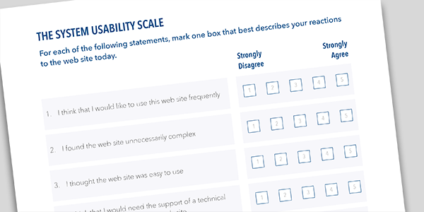
The System Usability Scale (SUS) is a tool developed by John Brooke in 1986. In recent years it has become the benchmark metric for evaluating different aspects regarding usability and the perception of individuals, for which it proposes the use of a questionnaire at the end of usability tests.
The test is based on a scale of five levels, ranging from “Strongly Agree” to “Strongly Disagree”. The model proposes that participants answer 10 key questions:
- I think I would use this system frequently.
- I think this system is unnecessarily complex.
- I think this system is easy to use.
- I think I would need help from a technical person to use this system.
- I think this system’s functions are well integrated.
- I think the system is very inconsistent.
- I think most people would learn to use this system quickly.
- The system seemed to be very complicated for me to use.
- I feel very confident using this system.
- I would need to learn a lot of things before I could start using this system.
Once the responses have been collected, the scale used must be converted to numerical format and the following formula can be applied:
SUS (score) = Sum of the answers in numerical format x 2.5
The resulting score is a value between 0 and 100. Based on the results of more than 500 studies, a score above 68 indicates that the usability perceived by users is above average.

Source: Userfocus
3. Net Promoter Score (NPS)
The Net Promoter Score (NPS) was developed by Fred Reichheld. It is a tool for measuring customers’ likelihood to recommend a product or service to others, a behaviour that is also linked to their loyalty to the brand and the brand’s ability to retain them in the long term. Products that are perceived as easy to use are generally considered to have a higher tendency to be recommended.
The NPS is based on asking respondents the following question: “On a scale of 0 to 10, how likely would you be to recommend the product to a friend or acquaintance?” The answers divide users into three main groups: promoters (for those answering 9 or 10), passives (for those answering 7 or 8) and detractors (for those answering 0 to 6).
Once this information has been collated, the formula for the NPS is as follows:
NPS (score) = Percentage of promoters – Percentage of detractors
The result ranges from a score of -100 to +100. A positive figure indicates that there are more promoters than detractors, suggesting high customer satisfaction and loyalty; a negative figure indicates the opposite.
4. Customer Effort Score (CES)
Customer Effort Score (CES) helps us to understand how easy or difficult it is to complete tasks when interacting with a product or interface and to resolve potential problems. It was developed in 2010 by Matthew Dixon, Karen Freeman and Nicholas Toman, and is based on the idea that reducing customer effort is essential to improving the user experience.
This metric uses the Likert scale and the direct question: “How easy was it for you to complete task X?” Respondents are given 5 to 7 choices in ascending order, with answers ranging from “very easy” to “very difficult” or vice versa. The results are then transferred to a numerical scale where 1 represents the least effort and the following formula is applied:
CES (score) = Total points / Number of responses
The result is a value between 1 and 5 or between 1 and 7, depending on the scale used. A low score indicates a lower rate of effort, which may reflect a positive user experience and the existence of a clear and usable interface.

Source: Retently
Were you aware of these metrics? At GammaUX we have a team of user experience experts who will advise you on how to make the most of these research tools. Contact us and we will guide you in how to design solutions that prioritise customer satisfaction.


