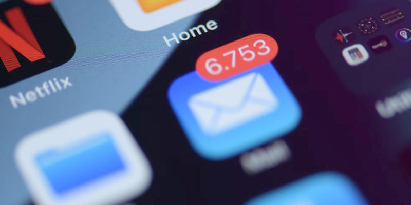
According to a Statista study, an estimated 347 billion emails are sent worldwide every day. Users receive a large number of messages in their inboxes, all competing to be seen, opened, and read. In reality, however, most of them are ignored, deleted, or marked as spam. Even worse, they might even lead the recipient to unsubscribe and completely disengage from the brand or service.
Achieving user engagement and conversion through newsletters is a complex task; one in which creating attractive designs is crucial to stand out in a saturated digital environment and capture the user’s attention.
In this article, we provide some tips to improve the effectiveness of this communication tool. We will address everything from the moment the user first encounters the email and decides whether to open or discard it, to when they access it to read and seek a relevant and personalized experience.
1. Getting them to read
After receiving the email, the user decides whether to open it based on three key elements: the sender, the subject, and the pre-header or preview.
The sender should be recognizable and trustworthy, and so should use the company’s domain, avoiding generic endings like @gmail.com or @hotmail.com. It could be the company name or personalized with an employee’s name (e.g., Irene from GammaUX), but could also indicate the type of content (GammaUX Newsletter) or refer to teams and departments (such as UX Designer at GammaUX or Strategy Team).
The subject should be attractive and brief, while still providing sufficient information about the newsletter’s content. It is best not to exceed 60 characters to be fully visible in various email clients, avoiding the use of all capital letters and excessive punctuation. One should also avoid sensationalistic messages or overly promotional tones, as they are often associated with spam.
Other strategies to achieve more attractive subject lines include: using the recipient’s name, numbers, emoticons, wordplay, or questions, in addition to terms related to the brand that are recognizable by its community and generate a sense of belonging and familiarity.
Lastly, the pre-header or preview should be an extension of the subject, providing additional information and reinforcing the theme of the email. It aims to provide context and new details about the message’s purpose, so it’s important to avoid displaying the “Open email in browser” text. Its visibility is usually influenced by the subject’s length.

Source: GetResponse
2. The importance of responsive design
Developing responsive design ensures that content displays correctly on different browsers and devices, preventing issues like text being cut off or overlapping with images. At a time where over 50% of global traffic is on a mobile, designing for smartphones and tablets is an investment in usability and creating a positive customer experience.
Some good practices for responsive newsletter development include:
- Increasing text and line spacing for improved readability.
- Adapting CTA dimensions for thumb-friendly clicking, leaving whitespace around it.
- Avoiding links to non-responsive pages and prioritizing deep links.
- Reducing content and condensing less relevant sections.
- Limiting sender and subject to around 30 or 40 characters.
Source: Mailjet
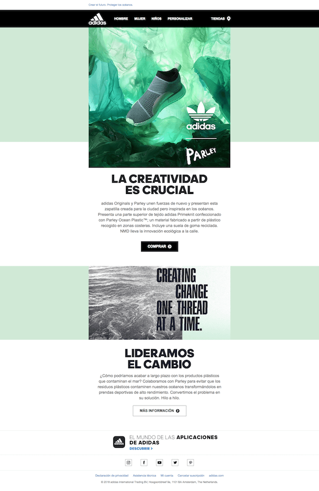
3. Reflect your visual identity
Consistently showing corporate identity across company emails reinforces customer recognition and trust. Always include a clearly visible logo, define a fixed colour palette for headers, CTAs, and long texts, and choose a maximum of two fonts that contrast well.
Avoid using generic or stock images, as users may associate them with other brands or products. Establish a hierarchy for displaying content and always end with the same footer, including contact information and links to social media.
Source: InboxFlows
4. Balance the use of text, image, and video
Long paragraphs make it difficult for readers to concentrate making them lose interest. Emails filled with images, infographics, or illustrations may convey a vague message and take a long time to load.
The key is to find a balance. Include relevant images to illustrate information, interspersing them among different text blocks. Ensure they use formats compatible with most browsers (such as .jpg, .png, or .gif), display with good quality but optimized weight, and include the alt attribute, as it influences whether a message is considered spam.
Use of videos comes with limitations and incompatibilities with many email clients. Though they are able to generate more engagement, it’s recommended not to embed them in the email but instead include an image or gif linking to the video hosted on an external platform.
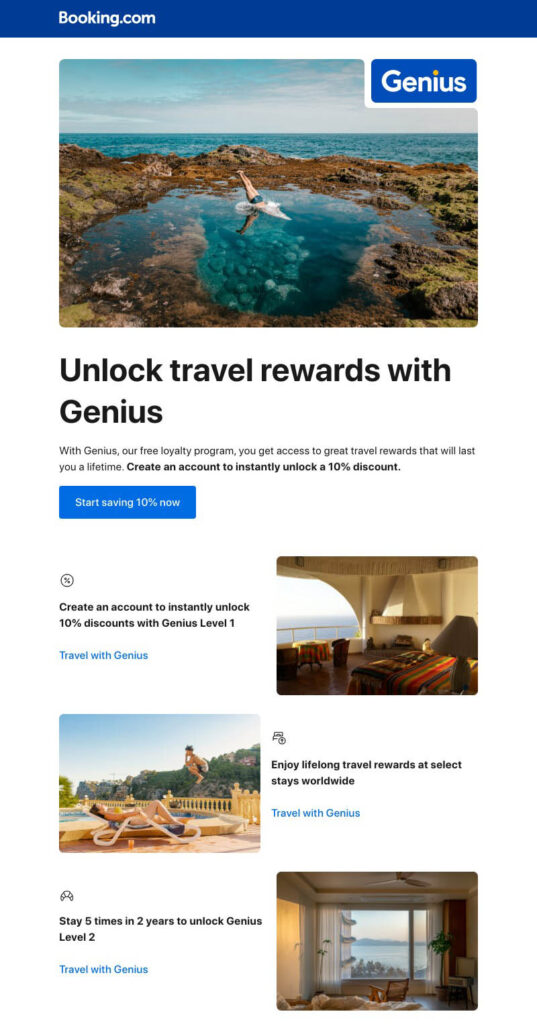
Source: InboxFlows
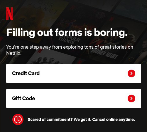
5. Choose the CTA wisely
CTA (call-to-action) buttons guide the user from the email to a specific action with the brand or service. According to a WordStream study, emails with a single CTA convert up to 371% more than those with two or more.
Position the CTA in a visible and contrasting place, using concise but personalized text. Avoid generic and ambiguous messages like “Try it” or “Subscribe.” Instead, opt for messages linked to the email subject, providing more information, such as “Try it free for 60 days” or “Subscribe to the blog,” for example.
It is also wise to assign different colours for each type of action and position this element in the upper half of the content. Adding reviews or key user data below the CTA can help build trust and increase conversion.
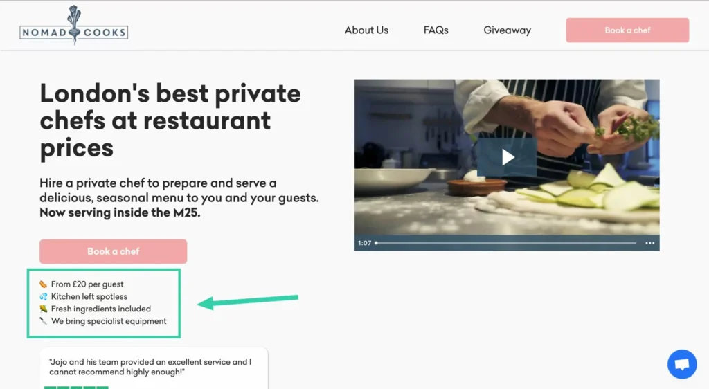
Source: Nomad Chefs
6. Don’t neglect the footer
Its position at the end of the newsletter might suggest that the footer is a secondary element, but giving it good design can contribute to credibility and reinforce the sales message.
This element has some basic legal requirements, like the need to include contact methods and the option to unsubscribe from company emails. However, it also presents an opportunity to add complementary elements, such as links to social media, the brand slogan, a discount code, or the location of points of sale.
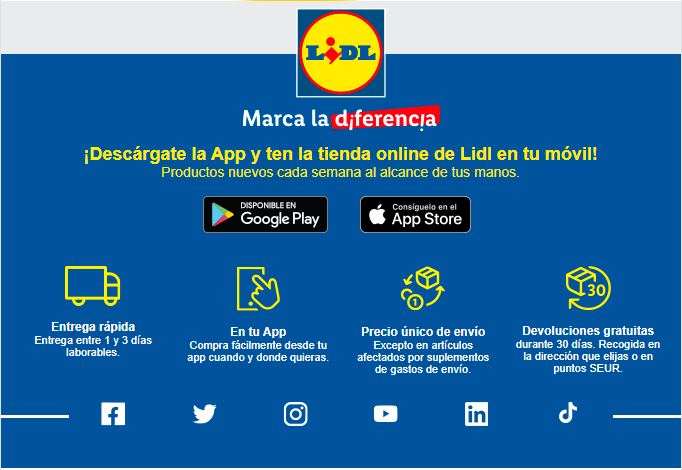
Source: Lidl
7. Convey humanity and closeness
Ultimately, a good email design is one that provides a personalized and relevant message for each individual. This can be achieved through dynamic content and recommendations based on customers’ browsing and previous purchase history. It can also be based on offers related to services they’ve shown interest in or unpurchased products left in their cart.
The ultimate goal is for users to perceive newsletters as a personal conversation with the brand rather than an indiscriminately sent advertising message.
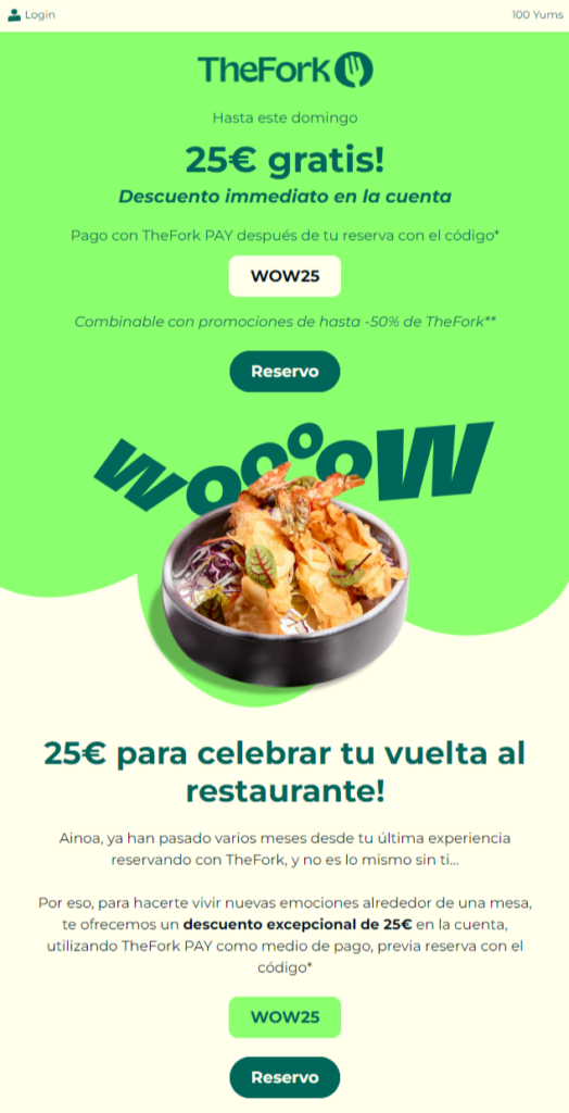
Source: TheFork
Do you want to improve the conversion rate of your newsletters? GammaUX has a great team of design and usability professionals that will analyse the design and effectiveness of your newsletters and help you optimize this powerful communication tool. Contact us for a free consultation!


