

Subscriptions have become one of the most relevant and sustainable business models for companies. What’s interesting is how this model has gone beyond the limits of digital services to take root in sectors that, until recently, seemed unthinkable—from Colvin’s flower bundles or Bookish’s curated literary selections to platforms like Notion or Headspace.
Subscriptions change the relationship with the user. They go beyond one-time purchases and propose an ongoing connection, offering benefits to both sides involved.
- For companies, subscription systems provide stability, recurring and predictable income, customer loyalty, and up-to-date insights into consumption habits.
- For consumers, they offer continuous access to the service, convenience, easier integration into daily life, potential savings, and a more personalized experience.
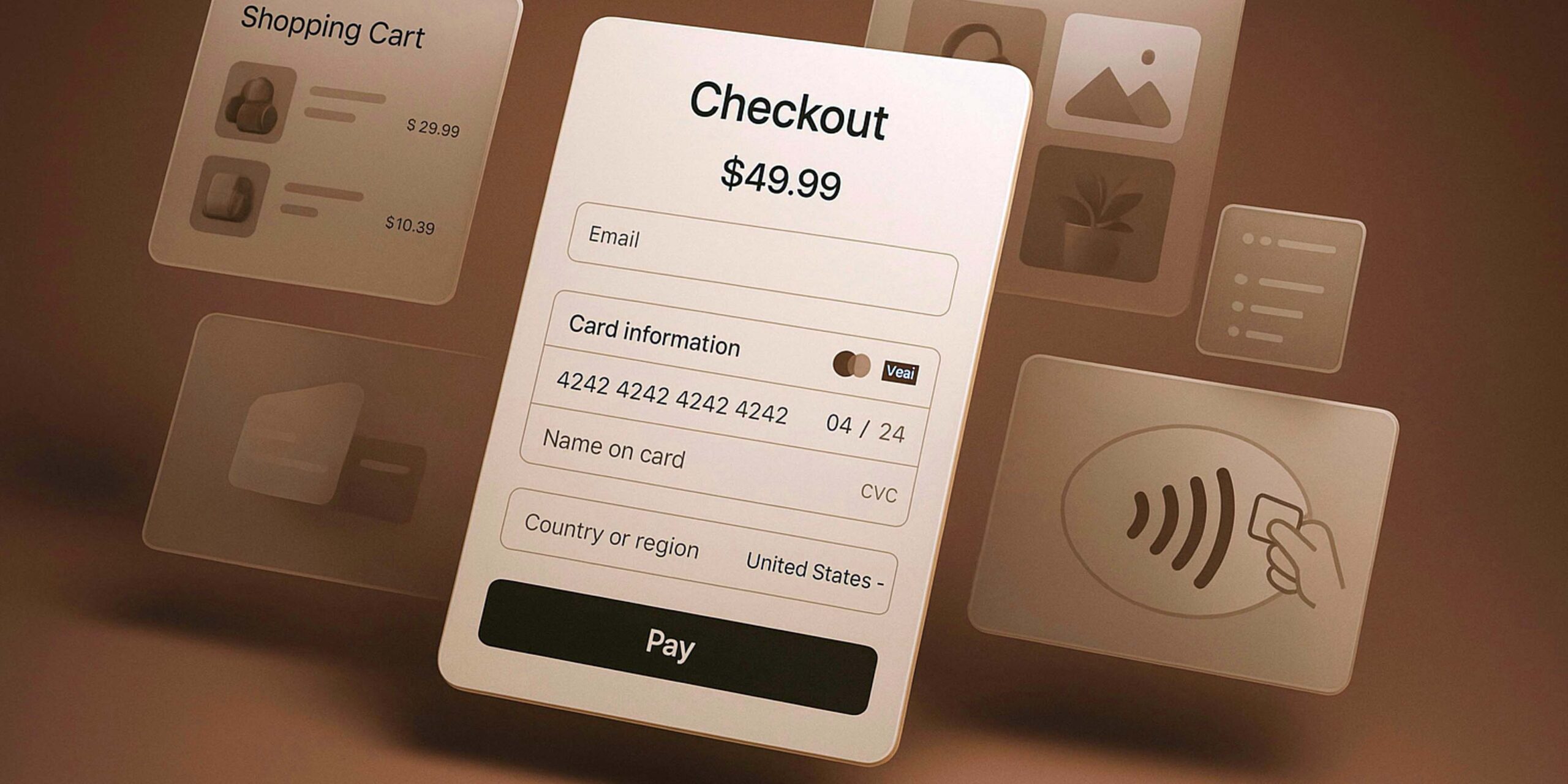
Because subscriptions rely on users setting up a payment method and committing to it, it’s important to design them in a usable and transparent way. These interfaces should display detailed, complete information about the service, minimize doubts, and provide a simple, understandable experience for all types of users.
Principles for a Great Subscription Experience
The following principles serve as a guide to designing subscription experiences that are understandable, accessible, and frictionless:
- Clear and direct language
Avoid technical jargon or vague expressions. The text should clearly explain what’s needed to make a decision—without embellishment or internal lingo. - Hierarchical visual structure
Use contrast, size, and spacing to guide the reading flow. The main information should be visible effortlessly. - Short and consistent step flow
Cut unnecessary forms. Each screen should serve a single action and offer immediate feedback after every interaction. - Transparency of information
Show prices, billing dates, and conditions before the user confirms their subscription. Don’t hide information under menus or secondary links. - Continuity after subscription
The confirmation screen should summarize what was purchased and guide users on next steps. This is an opportunity to reinforce trust.
Accessibility and multi-device adaptation
The process should be usable on mobile, tablet, and desktop. Ensure that elements have adequate size and contrast, with texts that are clear and easy to understand for everyone.
UI Design: The 4 Key Elements of a Subscription Service
Designing an effective subscription interface is not just about visual order—it’s about communicating trust. Every element—from the price to the action button—should help the user understand what they’re subscribing to, how much it costs, and how they can manage it later.
Below are the four essential components to achieve this:
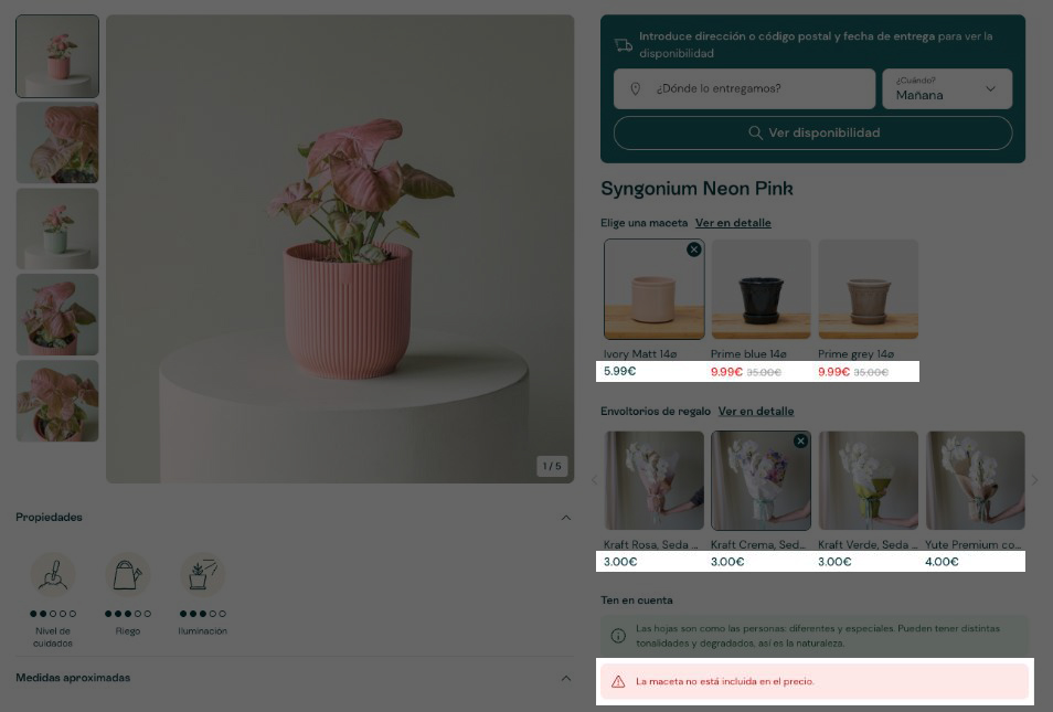
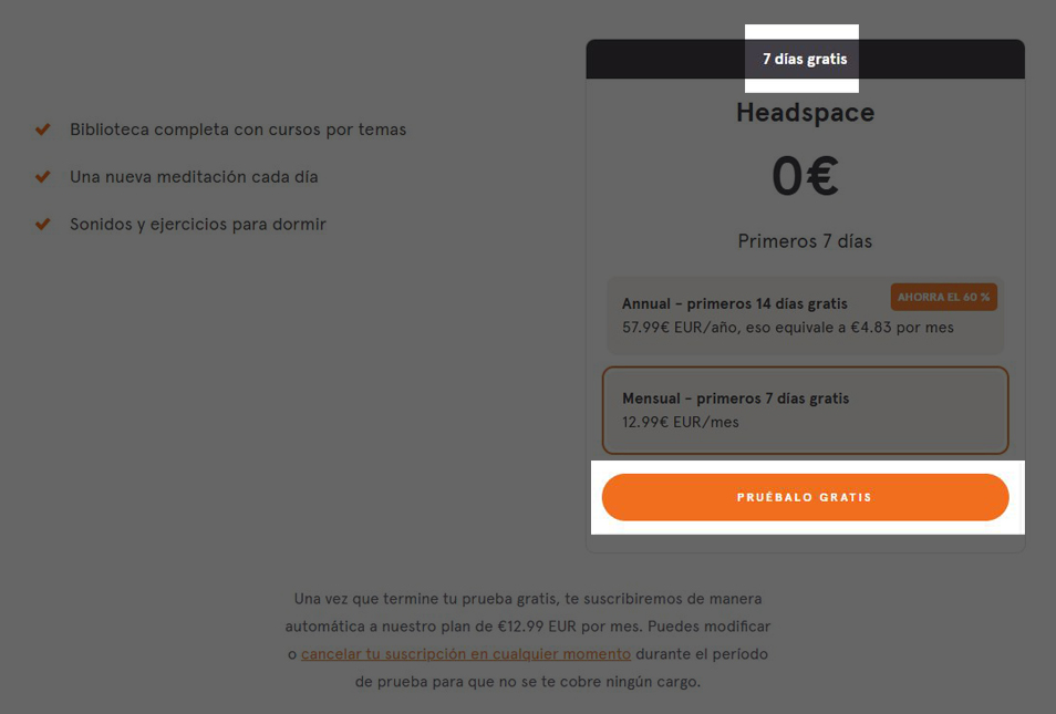
1. Price: Clarity Without Fine Print
Price is the first point of contact with perceived value. The goal isn’t to “make it cheaper,” but to display it transparently.
Best practices:
- Indicate the total cost per billing period (monthly, quarterly, or yearly).
- Show if there are additional fees or taxes, even small ones.
- If there’s a free trial, clarify when the first charge will occur.
- Add a visible tag with messages like “No hidden fees” or “Final price with tax included.”
- Avoid small fonts or low contrast, which can be perceived as a lack of transparency.
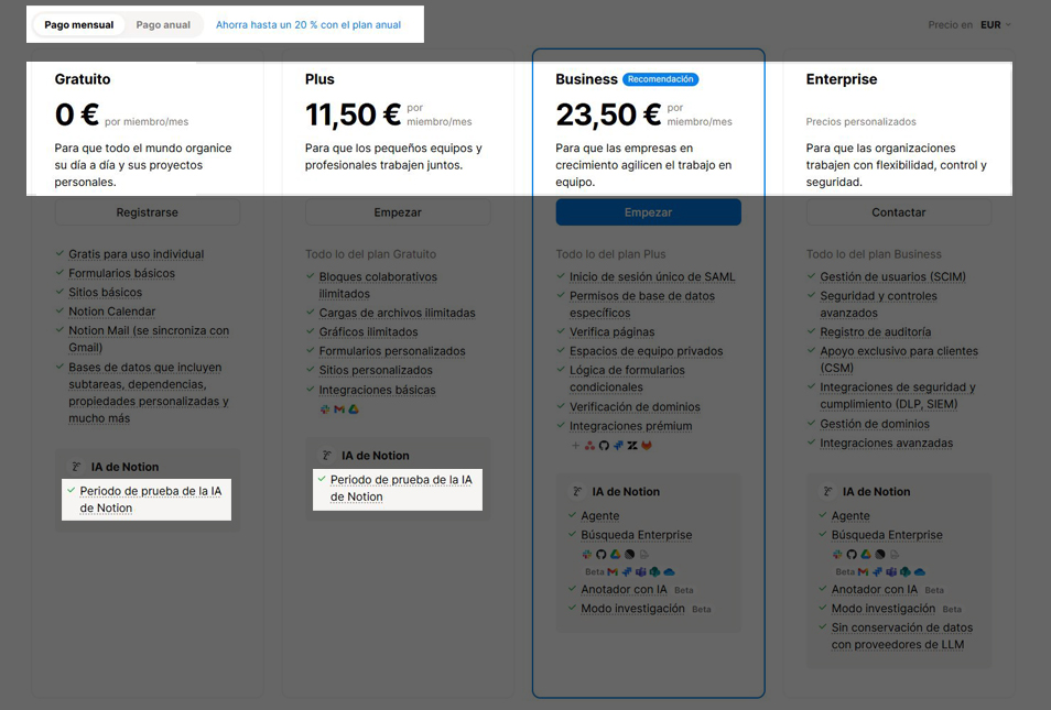
2. Subscription Model: Real Flexibility
The subscription model is the structure that translates product value into understandable options. Its design should balance simplicity and autonomy, allowing users to choose without feeling lost.
Best practices:
- Offer three to five clearly differentiated plans. More options often cause decision paralysis.
- Use clear names (“Basic,” “Pro,” or “Premium,” for example) and avoid internal jargon.
- Include a visual comparison showing what’s gained or lost when upgrading.
- Highlight one option as “Most popular” or “Recommended,” based on real usage data.
Always display the options to cancel, pause, or modify the subscription—feeling in control is key to conversion.
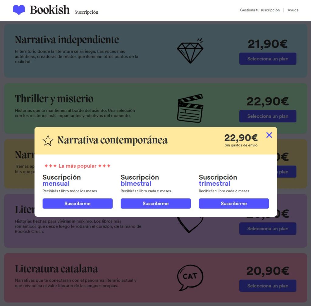
3. Periodicity: Time as Part of the Experience
Periodicity defines how often users interact with the service, directly influencing their sense of convenience and commitment.
Best practices:
- Allow users to choose from multiple frequencies and clearly explain how price or benefits change.
- Add examples or microcopy that connect to daily life: “You’ll receive your order every Monday” or “Your next payment will be on November 15,” for instance.
- Offer options like “Skip a month” or “Reschedule delivery” to help maintain long-term engagement.
- Send reminders before each renewal to promote transparency and reduce cancellations.
4. CTA: Clear, Unambiguous Action
The button—or Call to Action—is the key conversion point, but also the moment of highest cognitive load. In a subscription flow, it must combine information, context, and reassurance.
Best practices:
- Write CTAs with specific information: “Subscribe for $9.99/month” is more effective than a generic “Continue.”
- Ensure high visual contrast and clean space around the button.
- On mobile, a sticky button can work—just make sure it doesn’t hide relevant information.
- If the process has several steps, include a progress bar or supportive text: “Final step: Confirm your subscription.”
Reinforce trust after clicking with messages like “Your payment is secure” or “You can cancel anytime.”
Improve Your Subscription Service Conversions
In an increasingly competitive digital landscape, how a subscription service is structured and communicated can make a real difference in conversion rates. In this context, optimizing subscriptions means building an experience that creates both value and trust for all involved.
At GammaUX, we analyze each subscription model from both user and business perspectives. We identify friction points and help build clearer, more sustainable, and more valuable experiences for everyone.