

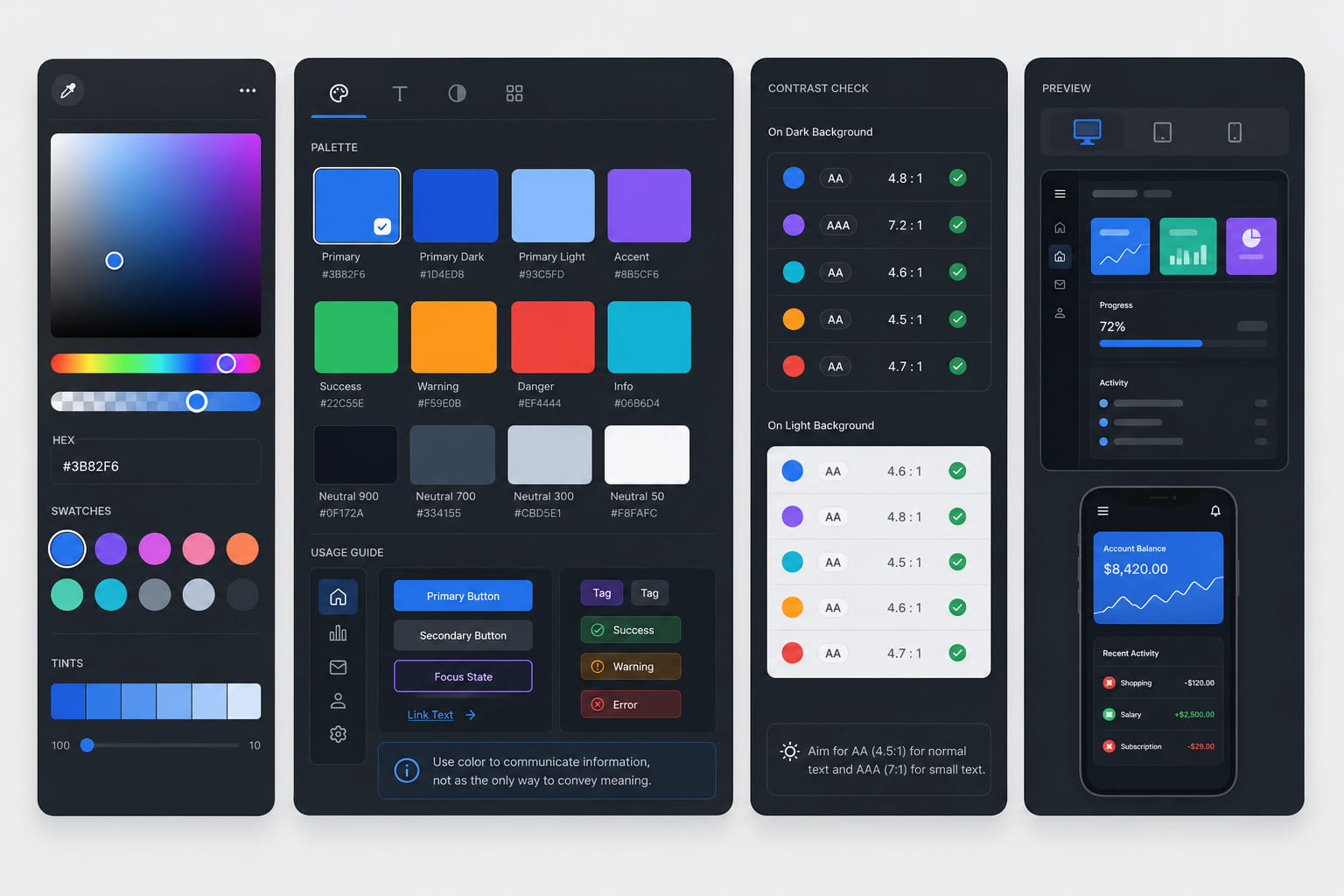
An accessible palette is experience infrastructure
In the first part, we looked at visual perception, contrast and luminance. In this second part, the focus is on how to turn those criteria into a usable system.
An accessible palette is not a closed visual deliverable. It is experience infrastructure: a shared foundation that helps the interface maintain readability, hierarchy and consistency as it scales across components, states, screens, themes and usage contexts.
For this reason, the challenge is not only to define a collection of colors. It is to build a chromatic structure that can scale without creating ambiguity or visual debt. To achieve this, the palette needs well-calibrated scales, clear roles, consistent states and contextual validation.
1. Define the scale that supports the interface
The first step should not be to assign a color to an action, an alert or a brand element. Before that, it is useful to define the base scale that will support most of the interface.
In many systems, that scale starts with neutrals, because they solve a large part of the everyday experience: backgrounds, surfaces, text, dividers, borders, containers and levels of emphasis.
The scale should not be understood as a collection of swatches, but as a sequence of steps with possible functions within the system. Each step should be able to answer a specific question:
- Can it be used as a background or surface?
- Does it provide enough contrast for text or iconography?
- Does it work as a border or divider without adding visual noise?
- Can it differentiate disabled, secondary or selected states?
- Does it combine well with adjacent steps?
From this foundation, brand colors and semantic colors can be integrated with more control, without forcing uses that compromise product readability or consistency.
2. Distribute scale steps according to use, contrast and combinability
A robust scale is not defined only through a mathematically uniform progression. It may look orderly in documentation and still fail to provide enough useful relationships when applied to real components.
Each area of the scale has a different responsibility. Some steps will be used for text, others for backgrounds, borders, actions or interaction states. For that reason, distribution should respond to intended use, required contrast and the combinations that will occur most frequently.
Mid-range steps are often especially sensitive, because they concentrate many functional decisions: actions, iconography, indicators, brand elements, active surfaces and components with significant visual weight.
A good scale is not only harmonious. It is combinable. It allows multiple relationships between text, background, border, action and state to be resolved without rebuilding the system on every screen.
3. Translate the scale into semantic roles
Once the scale has been defined, the next step is to translate colors into roles. This transition is key: it turns a palette into a usable tool for design and development.
Instead of working only with references such as “blue 500” or “neutral 300”, it is useful to define functions within the system:
- background,
- surface,
- primary text,
- secondary text,
- border,
- primary action,
- secondary action,
- success,
- error,
- warning,
- information,
- focus,
- selection,
- disabled.
This shift reduces one-off decisions and improves consistency across teams. The palette starts to function as infrastructure: it does not only define which colors exist, but what role each one plays within the experience.
4. Design states from the start
Color accessibility is not solved only in the default state. It becomes especially visible in interaction and feedback states: hover, focus, pressed, disabled, selected, error or loading.
Each state should maintain a perceptible relationship with the default state and with the rest of the components. If the difference is too subtle, the interaction loses clarity. If it is too strong, it can break hierarchy or create visual noise.
The focus state deserves specific attention. In products with keyboard navigation or high accessibility requirements, it should not depend on a weak color variation. It needs sufficient presence, consistency across components and compatibility with different backgrounds.
For that reason, states should not be added at the end as isolated variations. They should be part of the initial palette definition and its tokens.
5. Test the palette in demanding contexts
A palette may work well on a simple screen and fall short in more dense or complex scenarios. That is why it is useful to test it early in contexts where the system is under more pressure.
Dark mode
Dark mode should not be solved by simply inverting the light palette. Contrast perception, depth and visual weight change, so luminance, surfaces, borders, states and accents should be reviewed. The key is to maintain the same usage logic in a different perceptual environment.
Dashboards and dense tables
In dashboards, tables and operational tools, the palette needs to support fast scanning, data readability, identification of critical states and hierarchy between information levels. In these contexts, subtle differences degrade more quickly, and any ambiguity has a direct impact on efficiency of use.
Data visualization
In data visualization, color should help distinguish categories, patterns and priorities, but it should not be the only mechanism for understanding. It is useful to support it with labels, ordering, shape, weight, grouping or other resources that reduce the risk of misinterpretation.
6. Validate in real components, not only in swatches
Useful validation does not end with checking contrast ratios. It should also observe how the palette behaves in specific tasks, components and scenarios.
Some questions help detect whether the system works as intended:
- Are states detected quickly?
- Does reading maintain an appropriate rhythm?
- Is visual priority clear?
- Are errors and warnings identified without ambiguity?
- Can charts be interpreted without relying only on color?
- Does the interface preserve hierarchy in dense screens?
- Does the system work across different backgrounds and display modes?
Color-related issues often appear earlier in usage observation than in system documentation. When several elements seem to have the same priority, an active state is perceived as passive, or an error is not identified quickly, the issue is not only contrast. It may also involve hierarchy, perceptual distance, visual semantics or the relationship between color and component.
This validation should involve design, development and research. Design defines intent, hierarchy and visual behavior; development ensures that this logic is implemented consistently through tokens and components; and research helps verify whether users interpret states, priorities and relationships as intended.
Common risks when applying a palette to an interface
When bringing a palette into the product, there are several critical points worth controlling from the start:
- Meeting ratios without achieving visual clarity. Minimum contrast is necessary, but it does not guarantee hierarchy, scanability or information prioritization.
- Making meaning depend only on color. States such as error, success, selection or alert need support from text, iconography, shape, position or visual emphasis.
- Designing coherent but poorly combinable scales. A scale can be well ordered and still fail to provide useful relationships for text, backgrounds, states, tables or charts.
- Validating on swatches instead of components. A palette only proves its robustness when it is applied to buttons, forms, navigation, tables, charts, modals and real states.
Conclusion
Creating an accessible palette means moving from swatch to system: defining a base scale, distributing steps according to use, assigning semantic roles, designing states, testing complex contexts and validating in real components.
When this work is done with clear criteria, color stops being an isolated specification and becomes a shared tool for improving comprehension, efficiency and consistency in the interface.
At GammaUX, we understand color accessibility as a system-level decision. Designing color with intent requires combining visual perception, contrast, semantics, implementation and contextual validation. That is where the palette starts to deliver real value to the digital product.